Coursework
Wednesday 3rd May 2023
LO: To explore possible tasks and research similar products
Create a two minute sequence of an original music video to accompany a song about not giving up aimed at an audience primarily of 14-18 year olds.
Hall of fame
Here comes the sun
Its my life
Life is worth living
Call on me
Carry on
Rise
Gotta keep your head up
I will survive
The show must go on
We are the champions
Roar
I'm still standing
Wednesday 10th May 2023
LO: To research codes and conventions of similar products
Research
Keep Your Head Up - Andy Grammer
- The song is a narrative. It's about a man who has a hard life but no matter what he doesn't give up and he always tells himself to "keep his head up".
- The story links to the lyrics because it says things like "but you gotta keep your head up" and he gets back up from his downfalls.
- The production levels are kind of mid.
- The target is to people that are feeling down and need some believing in.
- The music genre is shown by the video.
- He's in a city and at the beginning there are 3 men that throw him in a bin, that's just the start of his downfalls.
- It appeals to people who aren't doing so well in life and they might relate to it - could be bullying or any type of problem.
- The band/artist are represented as happy because of the positive energy they give off.
Wednesday 7th June 2023

- They include a fitness woman (the image), the name of the magazine (masthead) and the name of the person with what she says
- The main image is of a model for fitness - usually either a model or celebrity
- The colour scheme is chosen by feminine colours since she is a female - like pink. But also blue and white
- The masthead is behind her head slightly, it's pink and the font is big but average
- There is one image - the woman standing and smiling
- There's around 8 cover lines
- The barcode is placed on the front, bottom right corner. The masthead is at the top. The year of the magazine is in the top right corner
- The fonts are mainly big and bold, although some are as if they've been drawn with a crayon or drawn with something. This is completely different to the bold

- The house style is coloured blue and brown which differs from the others, it looks like a train. This suits the colours and fonts being it's quite simple and casual
- The production values seem decently high. The term itself is not technical, but rather used by laymen. A film with high production value is one that has been made with lots of money and effort
- An ideology is a set of beliefs and values shared by a group of people. In media studies, we mostly focus on cultural ideologies, such as the representation of gender, race and social class. Some critics believe the narratives and messages coming from the mainstream media are simply a reflection of society. But it depends on the person and magazine
- The right use of colours and typographic choices in your website design can help in creating a positive first impression on your target audience. While using right colour combinations helps entice your visitors, typography makes it easy for the viewers to read the content. Usually fonts like "serif" are used
- People and places are used by what outfit they are wearing and where they are which suits the outfit (most of the time)
- The target audience is people that want to lose weight or gain muscle (20 - 30 years olds)
- Things like masthead and see what the DPS has similar to the front ( DPS is two pages of the same article covering both pages of an open publication. If such a Double Page Spread layout is featured in the centre of a magazine or newspaper, it is referred to as centre spread.
Wednesday 14th June 2023

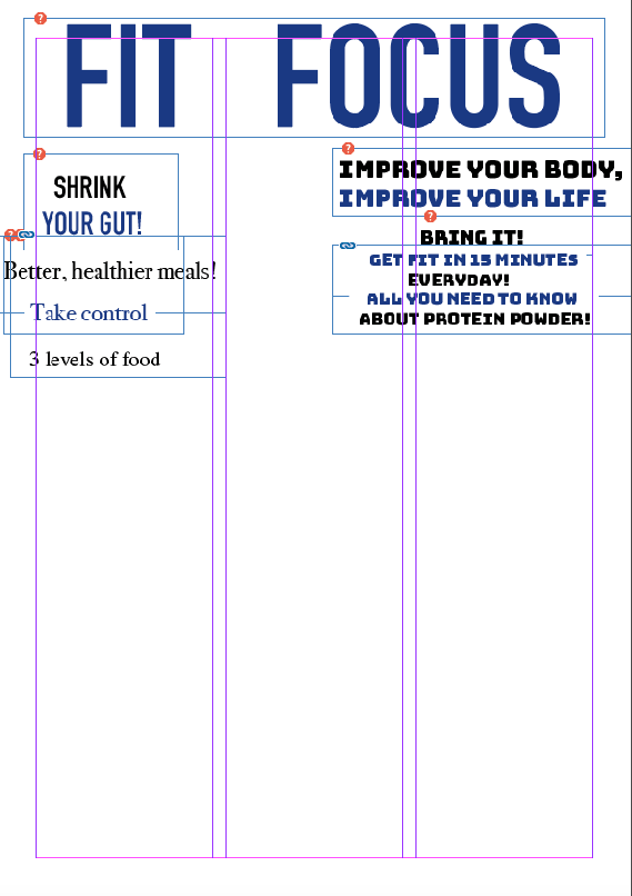
- Health and fitness magazine
- Typography: I want the test to be big and bold and bright colours to appeal to the right audience
- The image will be someone that is fit and healthy
- The masthead and logo design would need to stand out
- The cover would be unique with hopefully a spread out layout
- The content would include different work outs etc...
- The colour palette would be bright and appeal to the audience
- The DPS layout would have different work out routines etc...

Wednesday 28th June 2023
Target Audience
LO: To research our target audience to enable successful targeting

- For people interested in technology
- Men
- 30 - 50 year olds
- Interests

- Women
- Text
- Info
- Fashion
- Beauty

- Men
- Font
- Wealthy

Audience profile 14 - 18
- They may have a mixed opinion on school depending their age
- They could have hobbies of any sort of exercise or sport
- Probably urban
- Sport
- Once again sport and fitness (health)
- They would use social media to post about fitness and watch youtube work outs
- They would describe them as healthy and a determined person - ready to do the best they can
- They could listen to any song but maybe motivating songs? They probably would be fine with my hobbies but wouldn't want them theirselves
- Because it's about health and fitness which is exactly what they're looking for


RESEARCH:
ReplyDeleteGood research into conventions but 1 analysis is missing
TA PROFILE:
Basic but good
PLANNING:
A good start - I like the masthead but look at closing the gap between the words
I'd like to see more about how you're going to target teens.